Creating accessible content is to ensure your web content can be read and understood by the widest possible range of visitors with or without the use of assistive technologies. Here are some tips to address aspects of text presentation and emphasis.
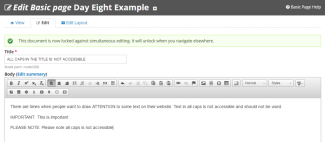
Watch the Use of All Caps
 All caps can be difficult to read and can be read incorrectly by screen readers. Screen readers often read CAPS by reading each letter individually instead of the whole word. Some screen readers will even confuse two letter words for the name of States, the word "IN" for example can be read as "Indiana." It is better to not use all caps. Draw attention to content by using "styles" and font attributes such as bold and italics. You can even highlight content by using the icon, button, or box shortcodes.
Do not simulate tab function with spaces
 Inserting multiple spaces to layout content is similar to trying to force content into columns using tables. Besides rendering the content non-responsive, it is not accessible. Most often in these situations content should be presented as a list.
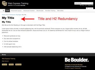
Title and H2 Redundancy
 Broadly speaking, headings and title structure help make your site accessible and your documents readable. They have other functions too, but these are their prime purpose.
The title should be an accurate statement of context; the Heading 1 should clearly define what the page is about and the heading levels should assist all users as they determine the structure of your content.
When screen readers read a web page, they start by reading the page title then continue to read the body of the page. If your page title and first heading are the same, then the information is repeated needlessly. Remove page title and h2 redundancy in pages on your site.
