Introduction
The COVID-19 pandemic had a profound and enduring impact on the United States, starting with the first reported case in January 2020 and the first reported death in February 2020 (CDC). By March of that year, the World Health Organization declared COVID-19 a global pandemic. In response, a race to create an effective vaccine began. Remarkably, within a few months, two vaccines were ready for distribution by December 2020 (Mayo Clinic). Throughout the next several years, the United States endured various waves of COVID-19 variants. In May 2023, the COVID-19 Public Health Emergency protocols for the United States ended. During this period, over a million Americans died (“United States.”).
This study aims to analyze the distribution of COVID-19 mortality rates across the United States to identify any discernible patterns. Specifically, it seeks to determine which areas had the highest likelihood of death for those who tested positive for COVID-19. Understanding these patterns could provide valuable insights into the factors that influenced mortality rates and help improve responses to future public health emergencies.
Methods
Data was collected by county from USAfacts.org then isolated to only contain deaths and infections from March 11, 2020 to May 11, 2023. March 2020 was chosen because that is when the WHO declared COVID-19 a pandemic. May 2023 was chosen because that is when COVID-19 emergency protocols expired and thus COVID data was no longer being as rigorously tracked. The study period was 2 years and 2 months (or 2.167 years for the purposes of calculations in Figure 4).
Hawaii and Alaska were excluded because they are not part of the contiguous United States. San Juan County (WA), Dukes County (MA), and Nantucket County (MA) were excluded because they are islands and were not bordering any other counties. While they may be connected by boats and air travel, it would be a mistake to assume that this transmission would be the same as being physically adjacent. In addition, boat and air travel was not considered for any other county. Because the US Census collects population data by region instead of county, Connecticut was also excluded. The regions were not simply conglomerates of various counties; parts of counties could be in different regions. Parts of Hartford County, for example, are in three different Census regions. County governments have ceased to exist in Connecticut since 1960 (Changes to County-Equivalents for Connecticut), but the COVID-19 data was still sorted by county, not region. Due to this inconsistency, it felt best to exclude the state. For the rest of the counties in the United States, population data was derived from 2020-2023 population estimates in the US Census; the numbers from 2020 were used.
The mortality rate is skewed to the right (See Figure 3). The median is 1.3172% and the mean is 1.4519%. Half the data falls between 0.9746% and 1.7318%, with the extremes falling at 0% and 10.0324% (See Figure 1). Because the data is not normal, a Kruskal-Wallis test was run to look at the mortality rate by state to see if there was a difference between groups. The p-value of 2.2e-16 indicates that the differences between the states are statistically significant; there is a very low chance this resulted from random chance (See Figure 2).
The COVID-19 death, infection, and mortality rates used in the analyses and maps were calculated using the equations in Figure 4.
The hotspot analysis was done by using the Getis-Ord GI tool in ArcGIS Pro, using the “contiguous edges corners” setting for county boundaries and COVID-19 Mortality Rates. Similarly, clusters and outliers were identified using Anselin Local Moran’s I with the same setting.
| Summary of Mortality Rates | |||||
|---|---|---|---|---|---|
| Minimum | 1st Quarter | Median | Mean | 3rd Quarter | Max |
| 0.0000 | 0.9746 | 1.3172 | 1.4519 | 1.7318 | 10.0324 |
| Kruskal-Willis rank sum test | ||
| Data: Mortality Rate by State | ||
| Chi-squared: 1200.2 | Degrees of freedom = 47 | p-value < 2.2e-16 |
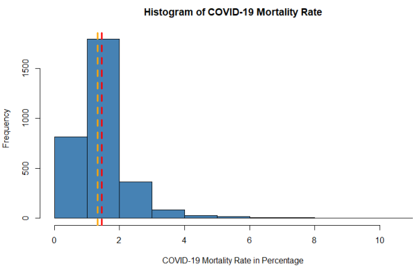
Figure 3. Histogram of COVID-19 Mortality Rates by county. The red line indicates the mean value and the orange line indicates the median.
| COVID-19 Deaths per 10,000 | COVID-19 Infections per 10,000 | COVID-19 Mortality Rate per 1,000 |
| [(All COVID-19 Deaths in Study Period)x10k) ----------------- [(2020 Population) x 2.167] |
[(All COVID-19 Infections in Study Period)x10k) |
[(All COVID-19 cases in study period) x 1k] |
Results
Figures 5 & 6
Figure 5 shows COVID-19 deaths per 10,000 people, while Figure 6 shows COVID-19 positive cases per 10,000 people. Both maps are shown per 10,000 people to adjust for population density. Neither figure shows whether these numbers are statistically significant in any meaningful way.
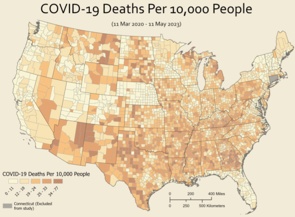
Figure 5. COVID-19 Deaths per 10,000 People.
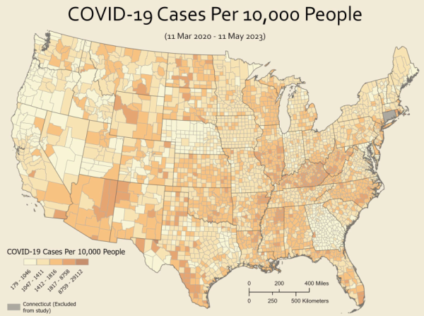
Figure 6. COVID-19 Infections per 10,000 People.
Figure 7
Figure 7 shows a hot spot analysis of COVID-19 mortality rates. Areas of note can be blue to indicate cold spots (where the chance of death from COVID-19 was lower than usual), or areas of note can be red to indicate hot spots (where the chance of death from COVID-19 was higher than usual); the darker shade of either colour indicates how confident the data is.
There are three confidence levels: 99%, 95%, and 90%. 90% confidence levels indicate that there is a 10% chance the clustering is due to random chance, 95% confidence levels indicate that there is a 5% the clustering is due to random chance, and 99% confidence levels indicate that there is only a 1% chance the clustering is due to random chance. This means that the areas with 99% confidence (darkest red and blue) are the most statistically significant.
The most significant hot spots (99%) include most of the state of Georgia (outside of the metro Atlanta area), northeastern Michigan, eastern Texas, and north-central Texas. Areas of lesser significance (95% confidence) include Hand County in South Dakota, along the Arkansas-Missouri border, western Texas (near Big Bend), parts of New Mexico (Catron, Socorro, Colfax, and Harding Counties), and Storey County in Nevada.
There were far fewer cold spots with 99% confidence but include Polk County in Florida, Grand and Eagle Counties in Colorado, and half a dozen in eastern Nebraska. Lesser cold spots (95% and 90%) cover a swath from northern Utah, north-central Colorado, and into Nebraska, as well as in Florida, New Hampshire, and Vermont.
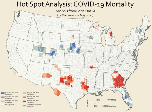
Figure 7. COVID-19 Hot Spot Analysis.
Figure 8
Figure 8 shows COVID-19 clusters and outliers in four distinct categories: high-high, high-low, low-high, and low-low.
High-high (pink) areas are clusters of high COVID-19 mortality (areas of high COVID-19 mortality rates surrounded by other areas of high COVID-19 mortality) and include most of south and central Georgia, Alcona and Ogemaw Counties in Michigan, and a string of counties in eastern and north-central Texas.
High-low (red) areas are outliers; their counties have significantly higher COVID-19 mortality rates compared to the low rates around them. These counties suffered worse than would be expected based on the surrounding counties. They include Moffat and Dolores Counties in Colorado, Sierra County in California, Nelson County in North Dakota, Le Salle County in Illinois, Coos County in New Hampshire, and Menifee County in Kentucky.
Low-high (dark blue) areas are also outliers; these counties have significantly lower COVID-19 mortality rates compared to the very high rates around them. These counties fared better than would be expected based on the surrounding counties. They include Stewart County in Georgia as well as Lubbock, King, and Shackelford Counties in Texas.
Low-low (light blue) are clusters of low COVID-19 mortality (areas of low COVID-19 mortality rates surrounded by other areas of low COVID-19 mortality) and include most of Florida, New Hampshire, Vermont, and Nebraska, as well as large swaths in northern Utah, north-central Colorado, southeastern Wyoming, California (San Mateo, Santa Cruz, and Santa Clara Counties form one cluster, while Napa, Lake, and Solano Counties form another), along the Minnesota-Wisconsin border, and in central North Carolina.
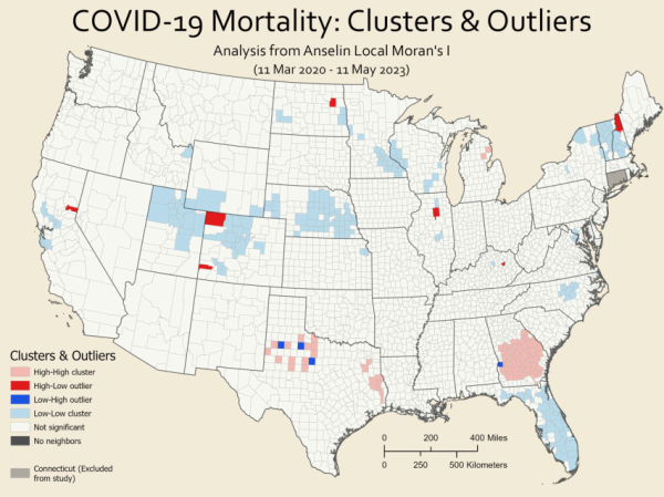
Figure 8: Clusters and Outliers of COVID-19 Mortality Rates.
Limitations
The data used in this analysis was sourced from USAfacts.org, a platform that aggregates information from various county public health departments across the United States. However, it is not clear if this data has been adjusted to account for factors such as age or other underlying health conditions, which could influence the results. Additionally, there may be inconsistencies in the methods used by different states and counties to collect COVID-19 data, leading to potential variations in the reported figures.
The exclusion of Connecticut may impact the counties around it: Westchester, Putnam, Dutchess, and Columbia Counties in New York; Berkshire, Hampden, and Worchester Counties in Massachusetts; and Washington, Kent, and Providence Counties in Rhode Island. Of these states, Rhode Island is most affected, as two of the three counties above only border counties in Rhode Island and Connecticut. For the rest of the counties listed above, the effect of excluding Connecticut is reduced, as the influence of the numerous adjacent counties moderates this impact.
It's important to note that the total number of COVID-19 cases reported does not include individuals who may have contracted the virus more than once. This means that reinfections are not reflected in the case counts. Furthermore, the reported deaths per county might include individuals who were not residents of that county. For instance, if a county has the only hospital in a particular region, it might appear to have a higher mortality rate because it records deaths of patients from neighboring areas. This could result in an artificially elevated mortality rate for that county.
Conclusion
The COVID-19 pandemic had a particularly severe impact on central and southern Georgia, as well as north-central Texas. These regions experienced higher mortality rates compared to other areas. Conversely, the pandemic was less deadly in regions stretching from northern Utah, through north-central Colorado, and into Nebraska, as well as Florida overall.
To understand the reasons behind these disparities, further research is necessary. Investigating why certain areas were more vulnerable while others showed resilience could reveal critical insights. This research should include examining both the low-high and high-low outliers as case studies. By identifying the factors and policies that contributed to these outliers, we can gain a better understanding of why COVID-19 mortality rates varied so significantly across different regions. This knowledge could be invaluable for improving public health responses in future pandemics.
Lauren Parkinson is pursuing a master's in Applied Geography and Geospaital Science.