Building Off the EPA Existing Walkability Index with Additional Factors of Sidewalk Area, Accessibility to Grocery Stores, Healthcare Facilities, and Parks

Figure 1: Denver 16th Street Mall
Introduction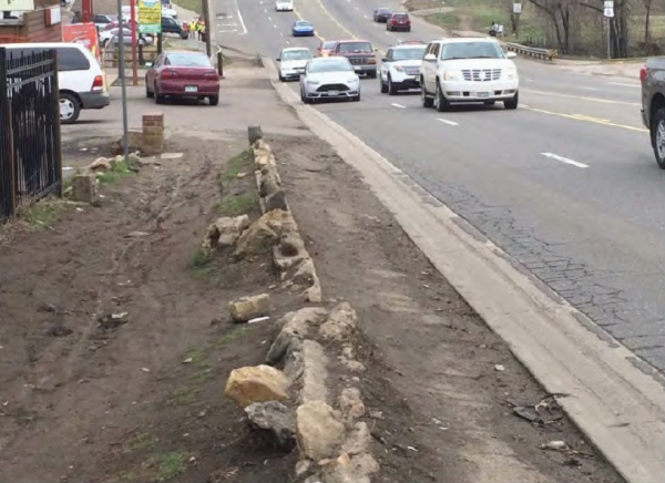

It is apparent that many US cities, especially those in the American West, are designed for the car. Infrastructure, beginning in the mid 20th century, was developed for the automobile, creating ramifications lasting until present day. People living in lower income neighborhoods that may not have a car as a form of transport are forced to navigate cities that are designed against them, resulting in a lack of connection with basic necessities that serve as essential human rights. As an aspiring urban designer and someone who is constantly seeking out the public transit system when arriving in a new city, I care very much about the car-free lifestyle. I recognize the benefits for one’s health, the environment, and the city as a whole when there are less cars on the road. However, in arriving at the design decisions that result in less car-centric infrastructure, I see the need for an in-depth analysis of how a city is currently functioning. Each city is a unique organism, requiring tailored attention. Being able to understand the walkability dynamics of a city is a beginning step to taking action and forming a design decision that can result in a more equally accessible urban environment.
This article, GIS analysis, accompanying methodology report, and following literature review analyzes the walkability of the city and county of Denver on a neighborhood scale, and compares this information with income data for each of the neighborhood communities. While an existing walkability index established by the EPA currently exists for the majority of cities within the U.S., it is lacking in many important criteria, such as accessibility to basic human necessities. As described in the widely accepted 15-Minute City concept, essential services such as food distribution, healthcare, greenspace, and employment opportunities within cities should be within a 15 minute walk or bike ride from one’s home to help foster a car-free environment (Luscher, 2020). Since the EPA established walkability index does not take into account these factors, I have created a new, more encompassing walkability index for each of the Denver neighborhoods. Seeing the new walkability index overlaid with the existing walkability index and neighborhood income data points to critical areas within the city that are in need of change for a car-free environment, and also highlights various communities that may not have previously been on the radar as being un-walkable. Further exemplifying the need for a more robust and diverse walkability index are Blecic et al.(2020) in Planning and Design Support Tools for Walkability: A Guide for Urban Analysts as well as the article Redefining Walkability: Examining equity and creating safer streets for all in D.C. The arguments put forth in these articles and their relationship to my work will be discussed in the mini literature review.

Figure 2: Existing Denver Walkability Conditions
EPA Existing Walkability Index: The Flaws
The EPA walkability index takes into account intersection density, proximity to transit stops, and diversity of land uses, but it does not incorporate information on the proximity of basic necessities such as food, work, and healthcare. Higher intersection density correlates with more walkability, shorter distances to transit stops correlates with more walk trips (and therefore more walkability), and a higher diversity of land use also correlates to more walk trips/walkability (Thomas et al., 2021). However, a neighborhood that has a diverse mix of housing/employment opportunities, a lot of people crossing the street, and short walking distances from residential units to transit stops, may not have a grocery store in the neighborhood that people can walk to in order to purchase healthy food. Even from my home in the City Park West neighborhood of Denver where there are 3 public transit bus lines in under a 10 minute walk from my front door, there is not a single full scale grocery store within a 15 minute walk. Therefore, accessing the grocery store from my neighborhood requires using public transportation, unless one wants to walk or bike upwards of over a mile with heavy bags of food. And, while this article does not focus on the public transportation issues that Denver faces, it should be noted that taking a bus to the grocery store from the City Park West neighborhood can still take longer than 15 minutes and be very inconvenient to plan. It is unfortunate to write that the most accessible way to obtain healthy food from my neighborhood is via driving. Therefore, even though the neighborhood may be assigned the 2nd highest walkability value, it is not walkable in terms of accessing basic amenities.
The ranked scores were then weighted by the following formula:16
Final National Walkability Index score = (w/3) + (x/3) + (y/6) + (z/6)
Where
w = block's ranked score for intersection density
x = block group's ranked score for proximity to transit stops
y = block group's rank score for employment mix
z = block group's ranked score for employment household mix
The block groups are assigned their final National Walkability Index scores on a scale of 1 to 20 (Figure 3). The scores are categorized as follows:

Figure 5: EPA Walkability Index Calculation
The other flaw associated with the EPA walkability index is that the values are assigned to a really small area: block groups; smaller than a census tract but larger than a census block (Thomas et al., 2021). The block size within cities differs from place to place and so the walkability index affiliated with each block may be misleading. For example, in comparing Denver with Manhattan, NYC, it almost appears at first glance that Denver has a higher walkable area than Manhattan, even though the population densities have an inverse relationship with that perception. The population density of Denver is 4,562 people/square mile (World Population Review), whereas the population density of Manhattan is 70,826 people/square mile (World Population Review). Some blocks on the Upper West Side of Manhattan appear as having a below average walkability. However, after having been a resident of the Upper West Side for 6 years, I can attest that this is not true. Even though a particular block might not have a subway stop contained within its boundaries, there might be one directly across the street, but technically within another block that is used in calculating the EPA Walkability Index.

Figure 3: Denver EPA Walkability Index

Figure 4: Manhattan, NYC EPA Walkability Index
Calculating a New Walkability Index: The 15-Minute City Concept
The 15-Minute City concept comes from a project started in 2020 by Dan Luscher, a resident of San Francisco, with the primary objective to raise awareness of the need to design & plan urban neighborhoods that are more accessible and safe for pedestrians. While the ideals behind this initiative stem from urbanism concepts that have been discussed and implemented for decades (especially outside of the U.S.), the specific project that uses the term 15-Minute City was conceived as a way to help cities build back better from the initial lockdowns that were imposed during the COVID-19 pandemic. Four key characteristics of the 15-Minute City as described by Carlos Moreno are proximity, diversity, density, and ubiquity, which are suggested to be achieved via broad public engagement, detailed analysis, engaging a mix of organizations, and finding cost effective solutions (Luscher, 2020).

Figure 6: 15-minute City Concept
Having the mindset that every citizen within a city should be invested in and involved with making a neighborhood more pedestrian friendly is a big component of broad public engagement. As quoted by Jane Jacobs in The Death and Life of Great American Cities, “Cities have the capability of providing something for everybody, only because, and only when, they are created by everybody,” (quoted in Luscher, 2020). Designers and planners may have the toolset to initiate change within a community and help communities go from unwalkable to pedestrian friendly. But what encourages the pedestrian friendly space to grow extensively and the culture of a neighborhood to blossom are the residents who live there and the people working within it. When the people of a neighborhood take pride in their space, the 15-Minute City concept can really begin to flourish. So perhaps the data driven analysis that analyzes the walkability of a neighborhood can inform design decisions that simply help catalyze an extensive effort by the city’s citizens to continue taking pride in the space and establishments that exist in their local neighborhoods.

Figure 7: East Colfax Avenue Art Mural
In addition to accessibility and proximity being core principles of the 15-Minute City concept, the neighborhoods must be affordable. In the U.S., for example, very few cities have 15 minute walking accessibility to basic necessities, and those that do are often very expensive to live in. Oftentimes in cities, new multi-use developments get all the attention especially when they claim to be walkable and accessible. However, what often gets overshadowed are the existing lower income neighborhoods that don’t have proximity to essential services. Perhaps some of the spotlight should be shed on these neighborhoods with more of an effort to weave amenities back into the existing neighborhoods that have been deprived of basic human rights; basic human rights such as the feasible procurement of healthy food, healthcare, and jobs. If accessibility and proximity becomes affordable for more residents within a city, then more people will be using the streets and the urban landscape, thus fostering an even more pedestrian friendly environment.

Figure 8: Ideals of the 15-minute City Concept
Even though the 15-Minute City concept guidelines suggest a neighborhood design where essential amenities are within a 15 minute walk or bike ride from one’s home, it is better to analyze the conditions of a neighborhood based on its walkability and design for walking as the prioritized method of transportation. For one, not everyone has access to a bike and/or may not have the physical means to ride a bike even if one was acquired. Secondly, while riding a bike with a backpack full of groceries is manageable, it may not be the preferred method of transportation, especially during the winter season in cold climates.
Why a More Robust Walkability Index Matters - The Inequities Associated with Lower Walkability
Many lower income neighborhoods tend to be the least walkable, even when compared with the existing EPA walkability index. In looking at Denver, many of the lower income and less walkable neighborhoods exist on the west side of I-25 and Speer Blvd. As most amenities exist closer to downtown on the east side of the highway, it is quite a challenge and dangerous to access them via walking. This is one example of how car centric infrastructure has completely torn apart a city, not just in terms of physical infrastructure, but in terms of the amount of people actively engaging with the urban landscape. Since less people are using the streets as pedestrian corridors, the EPA analyzes those specific neighborhoods as being unwalkable. To give more context as to why these neighborhoods are unwalkable, I am creating a new walkability index that highlights the fact that neighborhoods are not pedestrian friendly because of their lack of proximity to essential services. And in doing so, the new walkability index for Denver will also highlight unwalkable neighborhoods that may have previously been thought of as walkable. Therefore, there will be more context and accuracy given to these initial mappings that demonstrate what may need to be implemented to create more walkable and less income-polarized communities.


Methodology - Introduction
This project looks at the walkability of neighborhoods within the city and county of Denver. Since the objective of this project was to create a new walkability index for Denver neighborhoods, the data sources are not extensive. Most of the work involved running queries, joining tables, and adding new fields in order to come up with a new, comprehendible, walkability index. However, in order to run the calculations that resulted in the new walkability index, there were some key sources of data that were necessary.

Methodology - Data Sources
The data sources used were all vector shapefiles. These included neighborhood boundaries (to define the spatial extents of the project), the existing EPA walkability index (for comparison to the new walkability index and also to help calculate the new one), percent of low-moderate income levels in Denver neighborhoods (for overlaying with walkability indexes), as well as Denver food retail locations, healthcare facilities, public parks, and sidewalk shapes (all to assist in calculating the new walkability index). These data sources were obtained mainly from the Denver Open Data catalog, with the exception of the healthcare facilities (which was gathered from the Colorado Department of Public Health and the Environment), and the EPA walkability index (which was obtained from ArcGIS Pro Online).

Methodology - Analysis
The objective for the project analysis was to analyze the walkability based on Denver neighborhoods. The first step was to use the summarize within tool on the EPA Walkability Index. After bringing the neighborhood boundaries and EPA walkability index shapefiles into ArcGIS Pro (and projecting the map into CO State Plane Central) the summarize within tool was used to convert the assignment of the EPA walkability index from a block group to the neighborhood boundary. The same method was used on percent of low-moderate income data so that the walkability index could be clearly overlaid with income information within the same spatial boundary.
To begin thinking about a new walkability index, three new shapefiles were added to the project – food retail locations, healthcare facilities, and parks. These are point and polygon feature classes. Since food retail locations include convenience stores where healthy food options may not be available, the objective was to only map full scale grocery store locations. In order to do this a new feature layer was made with a query that only shows records containing a “grocery store” attribute. The same method was used to only show parks that are over 3 acres (where more recreational opportunities are likely to take place).

Once the desired amenities were placed on the map and a new feature layer created for neighborhoods as a point feature class, the proximity tool was used to find the nearest distance from the neighborhood point (centered within each neighborhood boundary) to each amenity. Tables were then combined so that all the nearest distances were in the same table. From this table, a new field was created and calculated to display an average of all the nearest distances. This information was then displayed visually in the form of a pie chart showing what the nearest and furthest amenity was from the center of the neighborhood.
In addition to amenity proximity being used in the new walkability index, the sidewalk area was also calculated for each neighborhood using a sidewalk polygon shapefile and the summarize within tool. Ultimately, the sidewalk area was joined with the nearest distances and then joined with the existing walkability index to calculate the new walkability index. The existing EPA walkability index was important to include in the calculation because it still contains factors that speak to walkability, such as proximity to public transit stops. The calculation is described as follows:
N = ((W – 10, 000) x -1) x S x M
Where:
N = New Walkability Index
W = Average Walking Distance to Amenities
S = Sidewalk Density
M = Mean National Walkability Index
Sidewalk density and mean national walkability index have higher values correlating with higher walkability. To get the average walking distance to amenities on the same page (currently lower value being more walkable), I had to get the inverse. My highest value (lower walkability) was around 9,000. Therefore, I subtracted 10,000 from all values to get every single one in the negative value range and then multiplied all values by (-1) to get them in the positive range again. This yields a higher value correlating with higher walkability. For instance, my lowest W value of around 150 (most walkable) became 9850:
(150 - 10,000) x -1 = 9850
Once the new walkability index was obtained, it was spatially joined with the table containing existing walkability index values. This way the new walkability index values could be adhered to the neighborhood boundaries and a choropleth made could be made that is overlaid with the choropleth map that was originally generated with the EPA walkability index. The Jenks Method was used to break the new walkability index into 4 classes, just as the existing EPA index has. Using the make feature layer tool in conjunction with running a query to only contain values within a specific class, new layers were created that only display information within those classes. Therefore, the new lowest walkability index value could be overlaid with only the existing lowest walkability index value, and so forth. This resulted in the series of maps using colors and hatch patterns. Finally, the new walkability index value was overlaid with existing walkability index values and percent of low-moderate income levels.


Methodology - Discussion and Conclusion: New Walkability Index in Comparison with Existing Walkability Index: How Can This Inform Urban Design Decisions?
By comparing the new walkability index with the existing one for each Denver neighborhood, it is apparent that a bunch of neighborhoods have been added to the classification of least walkable and 2nd least walkable under the new walkability index. It is noticeable that there was a trend of neighborhoods going from 2nd most walkable in the EPA existing walkability index to 2nd least walkable with the new walkability index, and similarly, neighborhoods going from 2nd least walkable in the existing index to least walkable in the new one. This observation lends itself to the conclusion that while a neighborhood may have accessibility to public transit, diverse land use composition, and high inhabitant density walking on the streets, its score is diminished because there is not great proximity to greenspace, grocery stores, and healthcare facilities, as well as by the fact that there may not be sidewalk space for people to walk on. Additionally, many of the lower walkability neighborhoods classified in the new score tend to be directly. adjacent to each other, thus prompting the thought that clusters of amenities exist in certain pockets of the city but not in others. The most walkable neighborhoods near downtown Denver are grouped together and, when compared with the map that highlights amenities as point feature classes, it is clear that those neighborhoods contain the highest density of amenities. Grocery stores and healthcare facilities especially are more widely spread out in the grouping of neighborhoods that are newly classified as having lower walkability. Being able to quickly see that there are a bunch of neighborhoods directly next to each other with low walkability based on the fact that basic amenities are not in close proximity, is very telling when it comes to making design decisions. What one decision creates in one neighborhood can easily affect what happens in the adjacent one. For example, if one of the newly classified low walkable neighborhoods along I-25, such as Ruby Hill, becomes more walkable with the addition of more grocery stores, healthcare facilities, or greenspace, then the culture and economic development of the neighborhood may also take off, resulting in a bigger desire to move to the neighborhood. This could lend itself to more public transportation development along the I-25 corridor, and ultimately more walkability in the neighborhoods directly next to Ruby Hill that are also classified as having low walkability. Additionally, the large grouping of neighborhoods that have low walkability also have the highest amount of low-moderate income levels within the city, further illustrating the need to focus on implementing more walkable design solutions within those communities.
Expanding the Conversation - How Does Denver's Walkability Compare with Other Cities and Existing Examples of Walkable Urban Design
Creating a new walkability index is in line with recent trends to redefine what walkability actually is within a city and how to best foster it. The journal article Planning and Design Support Tools for Walkability: A Guide for Urban Analysts (Blecic et al., 2020), states that “it may not be enough to just observe the distribution and the distances of opportunities in space” and that there is a “need to better and more analytically understand other factors that shape the relationships between individuals and urban space: factors related to the quality of the built environment, its conduciveness to be walked and traversed, its capacity to attract and encourage pedestrian mobility in the everyday life, and in general to stimulate people to use and engage with the city." Calculating walkability based only on the amount of people using the sidewalk is not necessarily the best measure of walkability. Yes, those people might be using the urban streetscape, but perhaps all of those people just got out of their cars and are simply dashing into the store to pick something up only to turn around and run back to their cars in under a few minutes time. The argument that Blecic et al. (2020) make is about measuring walkability based on the spatial qualities that would encourage people to actually spend time engaging with the streetscape. The walkability index that I spent time creating this semester begins to take this into account by incorporating the sidewalk area of each Denver neighborhood into the equation. If sidewalks are big and wide, more people might be encouraged to spend time on the streetscape. Not only because there is a larger buffer from the vehicles, fostering a sense of safety, but also because larger sidewalks allow for more activities to take place on the street, aside from just walking. Café tables and chairs can be set up outside an establishment, street art can be displayed, or vendors can even set up shop, all creating a vibrancy in the urban landscape and/or further helping to expand the economy of the community.
Blecic et al. (2020) go on to explain how the built environment can better encourage more walkability within it and therefore lead to better physical & mental health among the city’s residents. Even the vibrancy of a walkable landscape alone is argued to better support physical and mental health. In the new walkability index I created, a big focus was proximity to grocery stores, healthcare facilities, and large urban parks, all of which have a direct correlation with improving one’s health:
- Grocery stores contain healthy food for people to eat
- Healthcare facilities can provide remedies for ailments
- Parks contain cleaner air to breathe
Simply being able to access those amenities can improve one’s health to the point where they are able to engage with more physical activity and therefore able to add exercise to the repertoire of self-care.
In the article, Redefining Walkability: Examining equity and creating safer streets for all in D.C. (Jenkins, 2022) the authors demonstrate how a variety of various walkability measures highlight that walkability within neighborhoods has a racist history. Through a combination of different indexes it is argued that Black neighborhoods and communities with lower income have the least walkable environments, not only because of a lack of proximity to various amenities, but also because of poor pedestrian infrastructure, higher speed limits, more noise and air pollution, and also more policing. All of these factors discourage people from using the streetscape. In overlaying the new walkability index I created with income data in Denver neighborhoods, I found a similar trend. The neighborhoods with lower walkability scores also had the highest percentage of low-moderate income levels. From having been to some of those Denver neighborhoods I can attest that the infrastructure and physical urban environment is in worse shape than the wealthier, more walkable neighborhoods. Therefore, this illuminates the fact that it is not just about adding more amenities to a neighborhood to improve walkability and address systemic inequities, but part of the solution entails investing in the quality of the urban environment. To increase “racially equitable walkability across the city,” Jenkins (2022) also suggests that “D.C. planners and policymakers can:
- Expand tree cover in the densest parts of the city
- Increase non-automotive modes of transportation in central areas
- Reduce noise pollution
- Support more equitable access to key resources
- Prioritize road design that limits the need for police traffic enforcement”
Increasing tree canopy is an interesting corrective measure because it often carries the false assumption that it will lead to more crime, when, in fact, studies support that denser tree canopies actually reduce crime rates, allowing for people to feel safer when walking on the street. Additionally, even though a park might only be a 5 minute walk away, having more trees right outside one’s door on the street creates immediate access to greenery and cleaner urban air.
Jenkin (2022) concludes by stating, “walkability cannot be boiled down to one simple score,” and that “improving walkability in one community will require different solutions than in another." If given more time and access to unlimited data, it would be interesting to create a series of walkability scores for Denver. Having more walkability indexes can help pinpoint what may be making a community non-pedestrian friendly and therefore help inform a more targeted design solution for that particular neighborhood. Improving a community should be on a case by case basis, because each community faces unique systemic issues and the culture of the people that live there. While the new walkability index I created may not contain every factor associated with walkability, it begins to shed light on the need to incorporate a variety of factors, for the ones that currently exist do not encompass enough to highlight what needs to be addressed.


Dan Schumacher is a dual degree student in the Master of Landscape Architecture and Master of Urban Design programs.